Health insurance finder
Matching health insurance policies to user needs
Health insurance in Australia is a complex, confusing market. To truly stay to the mission of helping consumers, CHOICE decided to embark on a tool that help people pick the right policy for their needs.
Highlights:
Since launch, the tool is consistently in the top 10 converting pages
Positive feedback from both consumers and media coverage
My key achievements
Radically changed the scoring methods to meet user needs and expectation
Designed a new user flow to compare insurance policy
Introduced user-centred design to the cross-functional team
Built foundational UX for one of the most successful digital tools at CHOICE
Delving into the problems
A retro-fitted template
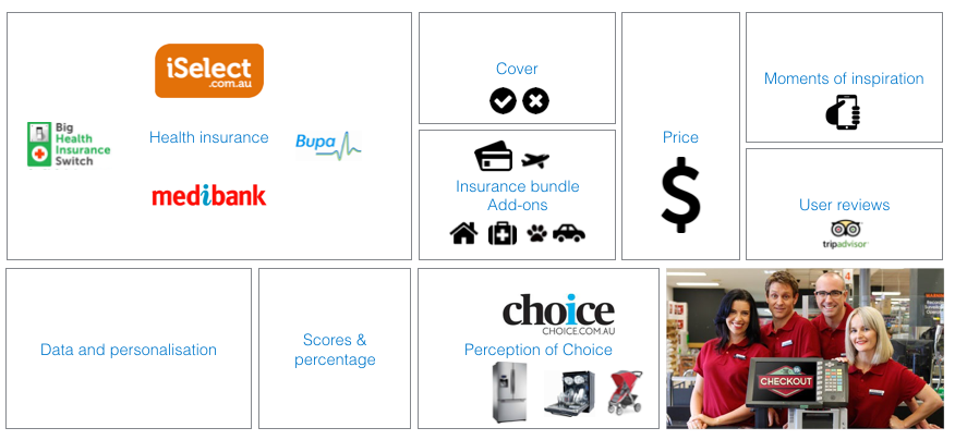
At the time, health insurance reviews were put in the same template as other physical product reviews (ie fridges and washing machines).
Users had to filter down the policies by checking on the left hand side what applies to them. This was proven to be problematic and confusing for a category where people expected high level of personalisation.
One way of scoring
For many years, CHOICE has been reviewing health insurance policy by using one formula, based on what an average Australian consumer might claim on, which may also include conditions that not applicable to each individual. The experts viewed more health cover as better- so they’re reluctant to change the formula.
User research
Combining with desk research, I interviewed 12 users who were either consider getting health insurance, or look into switching to a different policy. By digging deep into their experience regarding health insurance, I uncovered a number of important insights.
Common triggers: People started considering health insurance to avoid tax, or avoid lifetime health cover loading after turning 31, or when they have upcoming medical health needs like pregnancy and birth
Low engagement: Most people were confused between private hospital health insurance and extras insurance.
Short moments of inspiration: there were small windows of opportunities when people felt inspired to find out about insurance but they quickly moved on with other things.
Switching considerations: Price was a big motivation for people to switch, or after realising that they weren’t not covered for what they expected.
Tailored: People expected recommendations tailored to their personal circumstances.
Design approach
I assessed the different types of audience for the tools: ones looking to buy, ones looking to switch and ones looking for more information on health insurance and mapped out the high-level user stories.
As health insurance is highly complex and users expect to see policies that match their personal circumstances, I proposed the user flow with a decision tree wizard, then a set of relevant results and the policy comparison view.
User testing
To test the UX approach, I created an interactive prototype using Sketch and Invision with both members and non-members. The testing aims to answer the following:
Are the high-level user stories valid?
Is the decision tree usable? Is there any usability issues?
Is the way the experts scoring policy aligned with user needs and expectation?
Will non-members be interested enough to sign up to use the tool?
I invited health insurance experts to observe the testing sessions to watch users reactions, and questions about the topic.
What worked?
Key paths easily understood and addressed consumer needs
Gradual disclosure of decision tree succeeded in reducing information overload
Mobile-first design worked well in general
Comparison table made it easy to see policies side-by-side
Additional info on health fund pique consumer’s interest
What needed improvements?
Clearer contextual explanation for confusing terms and jargons such as private hospital network rating, complaint to membership ratio
Shortcut to the answer: people preferred to go straight to the comparison table rather than seeing the policy summary cards
Scoring of policy needs to be personalised to user needs
Iterations & outcomes
After this round of user testing and recommendations, I went on a six months maternity leave, and handed over to my colleague Adam to continue the UX work. The team has gone through many iterations of copy, and UI to get to the tool launched in June 2017.
CHOICE’s health insurance finder was lauded for its simplicity, and independence. It provides useful tips, and relevant results that save people money. As testimony for CHOICE’s mission to help consumers navigate this complex market, the page is consistently in the top 10 converting pages on the CHOICE’s site.


